
When my own wellspring of inspiration and self proclaimed insight seems to be temporarily running dry, I compensate by passing on to readers what I am learning from others. There has been a lot to learn from others and to pass on recently. I was particularly intrigued by the graphics and the conjecture in an article in the New York Times published on May 14 by Austin Frakt, “Medical Mystery: Something Happened to U.S. Health Spending After 1980.”
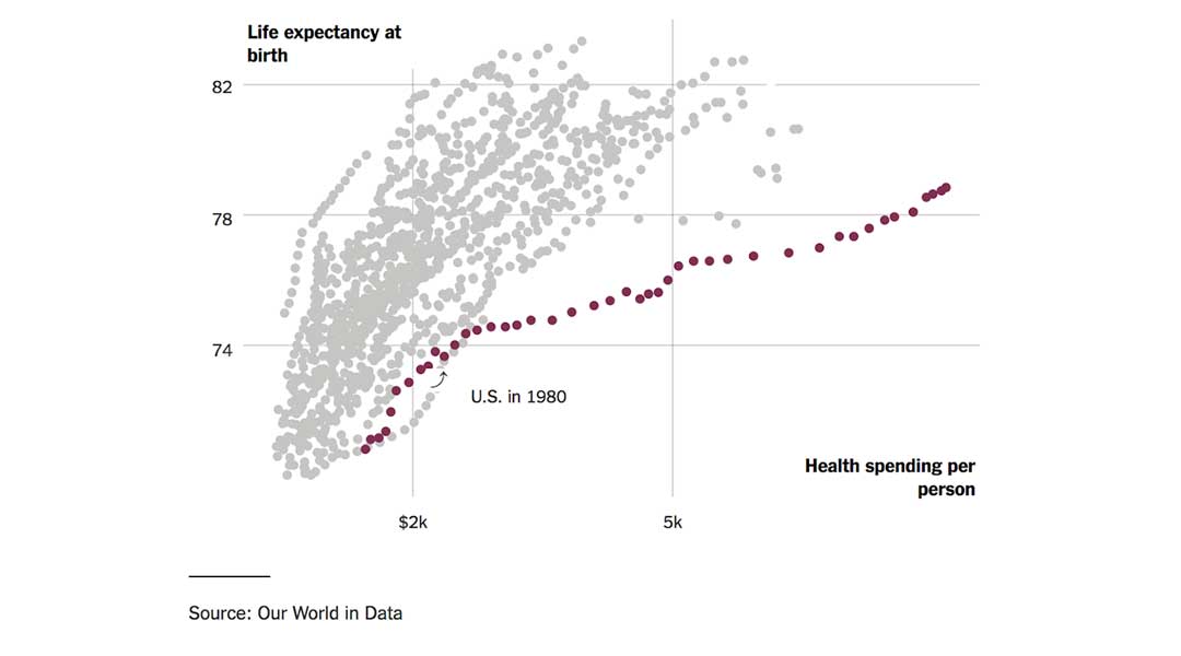
The takeaway for me after reading the article is that it seems like “the harder we try and the more we spend the behinder we get.” A lack of willingness to spend money is not the reason that our outcomes as measured by life expectancy are reason for a collective red face of embarrassment. My old coach use to humiliate me with game films when he was trying to assess blame for a failure on the field. He would say, “Gene, pictures do not lie!” That was in the sixties. Perhaps now we can photoshop lies and creatively present statistics to manufacture a point, but I am willing to accept the veracity of the graphics that appeared in Frakt’s article that I have copied to this post. We have seen this data before. What is new is the assessment that explains the graphics. There is much to be considered.
The graphic posted in the header of this post suggests that since 1980 the more we have spent the further we have fallen behind in relative life expectancy as compared with other advanced economies. The picture is depressing and should be motivation enough to cause us to sit down together and attempt to solve the problem with a bipartisan effort. How can we not ask the question, “What is going on here?” How can we not hold our elective officials accountable for the resolution of this disturbing reality? We should all be engaged in an attempt to answer the question, “Why do we spend so much and yet have such lackluster numbers?” Do the possible answers to that question include ineptitude or disinterest? It is easy to make an argument for either of those possibilities. We should also not exclude the possibilities of gross negligence, or a generalized focus on personal benefit without much regard for expense or the experience of others.
There is another good question to always keep in mind when trying to figure out the origin of a problem of performance. We should always ask, “What part of the problem am I/we?” As I look back on my career that lay largely within the bracket of 1980 to 2010, I am sure that the “total cost of care” was way down on my list of priorities. I was frequently asked to try to maximize my documentation to enable the generation of more revenue for the practice. It was not until the end of my career, after the publication of the Triple Aim, that I began to actively ask myself if I was doing my part to lower the cost of care that was passed along to my patient, the patient’s employer, or to taxpayers. It was not until the last decade that many of us began to ask how the cost of the care that we provided impacted the economy and affected our ability to fund education, expand jobs, improve infrastructure, or hold the line on higher taxes.
If dollars per person versus years of life doesn’t do it for you, then we should take dollars out of the analysis and just consider the progression in time of the gap in life expectancy between us and other countries, as the chart below demonstrates. Either presentation begs for an answer. Frakt has queried some pretty smart people and they have returned some thoughts that deserve consideration.
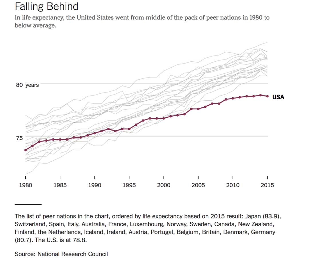
The first thing to notice in the graphic is that we were in a comfortable mid pack position prior to about 1980 during the Carter years. Carter was a micromanager with empathy. It looks like we began a slight drift toward the bottom during the Reagan-Bush One years. President Reagan was one of our best loved presidents. He preached self reliance, celebrated America, defeated Communism and had no empathy for “welfare queens.” The big surprise for me is that the drift continued during the Clinton administration. The welfare reform bill passed during the Clinton years did “end welfare as we have known it.” The trend toward lower life expectancy and higher cost of care have continued and the gap between us and other strong economies has widen since 2000 through the Bush II and Obama administrations. If there is a connection to which party is in power, it is hard to establish just looking at the time lines. The slope of our line is pretty constantly different than the rate of change in other countries over the last 35 or 40 years.
The first observation in the article as an attempt to answer the question is a reminder of the strange fact that life expectancy is not necessarily a function of medical care:
“Medical care is one of the less important determinants of life expectancy,” said Joseph Newhouse, a health economist at Harvard. “Socioeconomic status and other social factors exert larger influences on longevity.”
Paul Starr, the eminent healthcare sociologist from Princeton, is quoted to remind us that other countries “put limits on healthcare prices and spending.” We have been reluctant to take any steps to control prices in any part of our economy since Nixon’s brief experiment with “price freezes” in the early 70s. Frakt quotes Gerard Anderson of Johns Hopkins who points out that there has been a growing differential between what the U.S. and other industrialized nations pay for healthcare, and that Americans consume more care than their counterparts in other countries to which we are compared. Spending more might be good if there were improved outcomes to match our higher prices and greater utilization.
Is the answer a lack of competition? We have seen multiple waves of consolidation “for efficiency and projected “savings” that may have undermined the market benefits of competition.
David Cutler, a Harvard Medical economist is referenced because he suggests that we pay very high administrative costs in association with multiple insurers. Each additional insurer adds inefficiency will variations in contract structure and billing processes. In sum:
“According to a recent study, the United States has higher health care administrative costs than other wealthy countries.”
As the article continues there is a suggestion that everything is just too big and too ineffective:
“We have big pharma vs. big insurance vs. big hospital networks, and the patient and employers and also the government end up paying the bills,” said Janet Currie, a Princeton health economist. Though we have some large public health care programs, they are not able to keep a lid on prices. Medicare, for example, is forbidden to negotiate as a whole for drug prices…
All of the explanations seem plausible, but why did the separation occur after 1980? Did the economy become dysfunctional after inflation and the oil embargoes of the late ‘70s? A possible explanation is that we are victims of the rampant advances of innovations and a “medical arms race” among competing hospitals and practices. Innovations in other industries often lead to savings to consumers. So far the lower costs experienced in other industries as a benefit of innovation have not been the experience in healthcare. Business for medical innovators has been pretty good, but the data suggests that innovations have not led to improved life expectancies.
Statistics do not support the idea that the answer is in our racial diversity or in differentially higher rates of smoking and obesity. A lack of access to care for as many as 25% of the population of states that did not expand Medicaid with the ACA may be a partial explanation. Many of those same states restricted access to Medicaid before the ACA.
Our programs of maternal and child care since the ‘80s have improved the experience of our poor women and children. In 1980 we spent 11% of GDP on social programs while EU members spent 15%. In 2011 we spent 16% to their 22%. The difference in social spending does not seem big, but Gerard Anderson from Hopkins thinks that it might make a difference.
“Social underfunding probably has more long-term implications than underinvestment in medical care,” he said. For example, “if the underspending is on early childhood education — one of the key socioeconomic determinants of health — then there are long-term implications.”
David Cutler, the Harvard Economist, expands the idea that the real explanation may lie in social issues like growing economic inequity.
Slow income growth could also play a role because poorer health is associated with lower incomes. “It’s notable that, apart from the richest of Americans, income growth stagnated starting in the late 1970s,” …
The facts and data are not fake. The implications of the cost of care and the poor outcomes as measured by life expectancy are real and affect us all. The discussion has been and will continue to be one that will test us. So far the facts alone seem not to bother many people both in and out of healthcare. If we have difficulty discussing “climate change questions,” there is every reason to believe developing solutions that really lower the cost of care and improve life expectancy will also challenge us. The numbers and the trends should worry us all, but are we really concerned?
Collectively, we should ask that our government look for explanations of the observation that life expectancy is falling even as we spend more and more money on care. We should use elections as a way of identifying legislators who will engage in the discussion of why and will take on the search for solutions that both lower the cost of care and improve the quality of the care that every resident of this country can expect to receive. Looking back over our history we have most effectively come together in response to external military threats. It is my opinion that the health and social welfare of all of our citizens deserve at least as much bipartisan cooperation and energy devoted to the search for solution as we invest in our collective military defense.